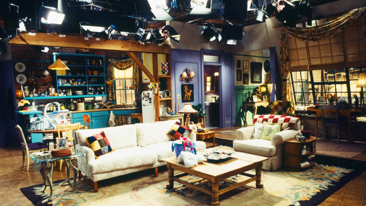
That Monicaâs apartment appears relatable (though the debate about whether any of the characters would have been able to afford their places rages on) is a testament to production designer John Shaffner, his partner Joe Stewart, and set decorator Greg Grande. When creating the space, Shaffner and Stewart referenced their own former New York City sixth-floor walkup, and Grande filled it with furniture that appeared collected and like it could have been secondhand. âUltimately, these kids did not buy their furniture at stores. They found it on the street. They inherited some of it. They bought some at vintage shops because it was cheap, especially then,â Shaffner tells AD.
Along with the showâs cocreators, Marta Kauffman and David Crane, and producer Kevin Bright, the design team decided that the sets should be âalive,â says Shaffner. âWe said, âThese are living people. Things change.â We changed the flowers every episode. Little things just kind of slowly evolved, like the magnets on the refrigerator door.â
Ultimately, it is the distinct, unchanging elements of the setsâthe punchy purple walls, the whimsical gold picture frame around Monicaâs peephole, the cushy orange sofa in the coffee shop, and the fountain in the opening creditsâthat give the show a distinct visual identity and clearly establish the world the titular friends inhabit, a world that fans are invited to step into or bring to life in whichever way they choose. As Gannon puts it, when watching the show, âit was like you were the seventh friend.â

